
never compromise on safety
How we transformed an industrial giant into a human-centric safety partner
The Challenge
HAKI was the world's best scaffolding supplier, but that was becoming their biggest problem. Despite market leadership, they were perceived as old-fashioned, rigid, and lacking innovation. Competitors were challenging them on price, innovation, and modern appeal.
The company needed to evolve from being seen as just a product supplier to becoming a trusted safety partner for people working in challenging environments worldwide.
The Strategic Insight
Instead of fighting the perception of being "industrial," we embraced HAKI's true purpose: protecting people. Our insight was that safety isn't just about products - it's about the humans who depend on them.
We developed "Never Compromise on Safety" as both a promise and a philosophy, positioning HAKI as the company that puts human safety above everything else.
The Creative Solution
We created a complete brand transformation that moved HAKI from product-focused to human-centric. The new identity celebrated the people who work in tough conditions, not just the equipment that protects them.
The rebrand included a modern visual identity, refined messaging, and a clear brand architecture that could support future growth and acquisitions.


The Execution
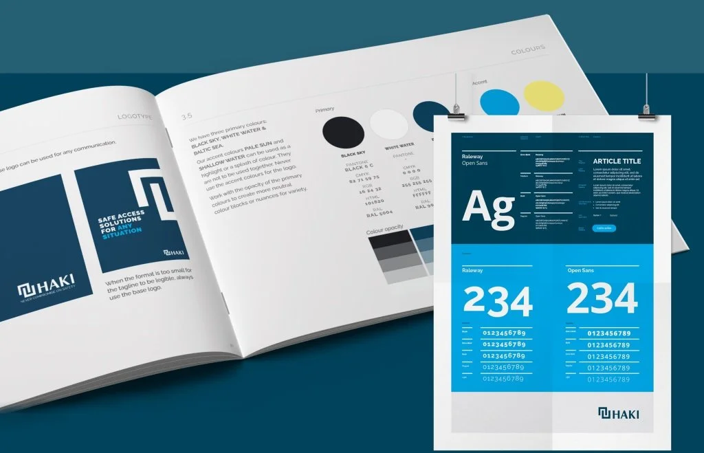
Complete visual identity redesign with modern typography and color system
Brand strategy that positioned safety as a human value, not just a product feature
Comprehensive brand guidelines for consistent global implementation
Brand architecture framework for future acquisitions and product launches
Internal culture transformation to support the new brand promise
My Role
Creative Lead & Senior Art Director
Led the strategic repositioning from industrial supplier to human-centric safety partner
Developed the "Never Compromise on Safety" brand essence and supporting messaging
Directed complete visual identity transformation including logo, typography, and color systems
Created comprehensive brand guidelines and implementation strategy
Managed stakeholder alignment across global markets and internal teams